Step 7
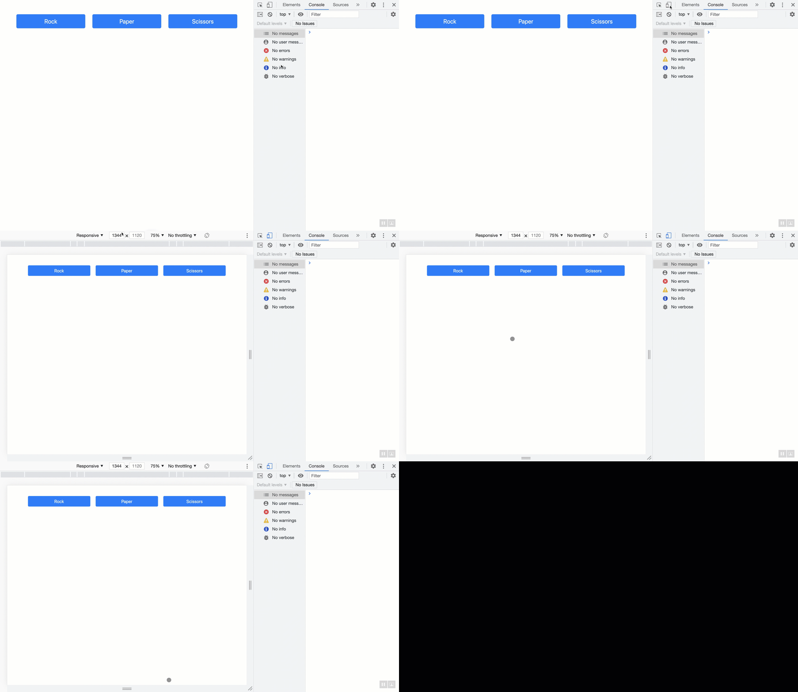
Let's see how Bootstrap helps with responsiveness. First, open the developer tools and click the "Toggle device toolbar" in the top left corner of the Developer Tools window.

Next, adjust the screen size as shown in the animated Gif below,

Notice as the screen size changes, the page margin, the size of the buttons, and the spaces between them are adjusted. When the screen width gets smaller than a certain size, the column layout gets stacked on one another (as opposed to becoming so small that it is not legible):

The point at which Bootstrap decides to stack the columns is called a breakpoint. Bootstrap breakpoints are customizable widths that determine how your responsive layout behaves across devices.